
TRACE ELEMENT MAPPING “Where Science Meets Visualization”
Visualizing Laser Ablation ICP-MS Data:
At the Applied Isotope Research Group (AIRG), we are at the forefront of innovation in geochemical research, transforming the way scientists interpret and interact with their data. Through the seamless integration of advanced Laser Ablation Inductively Coupled Plasma Mass Spectrometry (LA-ICP-MS) techniques and sophisticated data visualization software, we provide researchers with tools that bring their data to life. Our trace element mapping software is a testament to this commitment, designed to unlock the hidden complexities within geological, environmental, and biological samples.
This software enables scientists to explore spatial distributions of elements and isotopes at unparalleled resolution, offering insights into processes ranging from ore deposit formation and biomineralization to environmental changes recorded in shells and fossils. With features like customizable heatmaps, interactive RGB maps, and overlay capabilities, researchers can easily correlate elemental distributions with textural features in their samples, identifying patterns that were previously difficult to detect.
Incorporating real-time data smoothing and multi-isotope visualization tools, the software ensures accuracy and flexibility in data interpretation. It also supports seamless image exports in multiple formats, making it ideal for presentations and publications. By enhancing the clarity and depth of LA-ICP-MS data, this platform allows scientists to unravel complex stories embedded in their samples, fostering discoveries that push the boundaries of isotope geochemistry and trace element analysis.
At AIRG, we are not just developing tools—we are empowering researchers to see the unseen, interpret the intricate, and advance our understanding of Earth’s processes and history.

Key features:
- Menu Panel (Left Sidebar):
- Menu Options:
- Load Data: Import data for processing.
- Add Data: Append new datasets.
- Save As: Save the project with a new name or location.
- Open Project: Open a saved project file.
- Map Options:
- Heatmap: Generate and view heatmaps.
- RGB Map: Display RGB visualizations.
- Canvas: Access additional visualization tools.
- Menu Options:
- Trace Element Mapping Panel (Middle Panel):
- Initial Parameters:
- Select Reference Material: Choose a reference material for calibration.
- Polynomial Drift Correction: Activate and adjust drift correction with a selectable polynomial degree.
- Export Image:
- Choose the image format (JPEG, PNG, TIFF) and export the visualization.
- Data Type:
- Combined: Use processed or smoothed data.
- Initial Parameters:
- Heatmap Plot Windows (Top Right and Bottom Right):
- Load Overlay Image: Import an overlay for comparison.
- Select Isotope: Choose an isotope for heatmap display.
- Smoothing, Contrast, Brightness: Adjust visualization settings.
- Overlay Opacity: Control overlay transparency.
- Image Viewer (Bottom Left and Right Panels):
- Transparency, Brightness, Contrast, and Sharpening Controls: Fine-tune the image’s visual appearance.
- Overlay Width and Height: Adjust the dimensions of the overlay.
- Lock Maps: Synchronize overlay and heatmap positions.
- Colour Bars (Right of Heatmaps):
- Gradient Scales: Represent intensity or concentration values of selected isotopes.
- Adjustable Markers: Customize the color bar’s value thresholds.
✨ Bringing Data to Life
Gone are the days of static charts and overwhelming datasets. Our interactive heatmaps breathe life into your data, showcasing trace elements and isotopes with stunning, customizable colour gradients. Each colour shift tells a story—of intensity, distribution, and geochemical behaviour.
🛠 Precision at Your Fingertips
Our tools are designed with flexibility in mind:
🔧 Customizable Analytical Parameters
Tailor your visualization to the specific needs of your study. Adjust spot sizes, integration times, and elemental sensitivities with ease, ensuring that every nuance of your data is represented accurately. Our platform offers real-time parameter tweaking, letting you iterate quickly and efficiently.
📊 Layered Data Overlays
Compare multiple datasets simultaneously by overlaying trace element concentrations, isotope ratios, and background signals. This multi-dimensional approach allows for cross-comparisons that reveal subtle correlations and enrich your interpretations.
📍 Interactive Data Point Selection
Zoom in on regions of interest and click on specific data points to retrieve precise measurements and metadata. Our tools allow you to highlight anomalies, outliers, or patterns, streamlining the process of pinpointing significant geological or environmental events.
⚙️ Seamless Export and Integration
Export your visualized data directly into your preferred formats for publication or further analysis. High-resolution images, CSV data files, and customizable reports ensure your results are ready for presentation or deeper statistical evaluation.

🌌 Explore the Invisible
Imagine revealing intricate trace element patterns across your sample, zooming into hotspots, and instantly seeing what the naked eye can’t. Whether you’re studying fossilized remains, mineral deposits, or ancient rock formations, our tools unlock a new dimension of insight.
This is more than just visualization—it’s exploration redefined. With our interactive platform, scientists can move beyond raw data to draw meaningful conclusions, driving innovation in environmental studies, archaeology, mineral exploration, and beyond.
What the video below for a preview of what is coming soon at AIRG:
These images showcase heatmap visualizations of isotopic data analyzed using LA-ICP-MS, with each panel representing a specific isotope and data type.
📊 What is the Heatmap Project?
The project involves developing an intuitive platform for visualizing spatially resolved data, such as trace elements or isotopic ratios, collected via LA-ICP-MS. Instead of relying on traditional static plots, we’re implementing interactive heatmaps that allow users to explore and interpret their data directly within a graphical user interface (GUI).
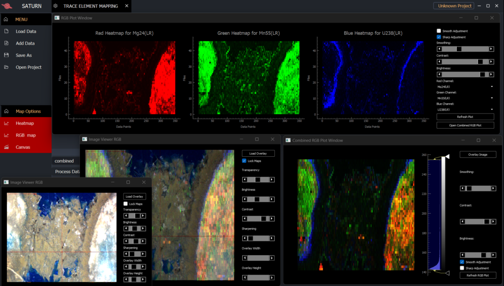
Interactive Visualization of LA-ICP-MS Data: Combined RGB Plot and Individual Heatmaps for measured Isotopes
The figure below displays an integrated approach to visualizing isotopic data using RGB channels and individual heatmaps. The top section shows combined RGB plots highlighting the spatial distribution of Mg (red), Mn (green), and U (blue) isotopes. The bottom section provides separate heatmaps for each channel, emphasizing individual isotopic patterns. Adjustable controls for smoothing, contrast, and brightness, as well as channel selection, enable detailed customization for enhanced interpretation.
Integrating Quantitative and Qualitative Analysis for Heatmap Interpretation
Quantitative and qualitative image analysis are complementary approaches used to interpret data visualizations such as heatmaps. Quantitative analysis provides numerical information, such as the signal intensity in counts per second (CPS) or parts per million (PPM), which can be precisely obtained by hovering the mouse over the heatmap plot. This enables users to identify specific data points, evaluate variations across the dataset, and quantify trends or anomalies within the mapped region. In contrast, qualitative analysis focuses on interpreting the visual patterns, colour gradients, and spatial distributions within the heatmap to infer broader insights, such as identifying high-intensity zones, linear features, or areas of variability. Together, these analyses facilitate a robust understanding of the data, allowing both detailed numerical evaluations and a broader contextual interpretation of isotopic or geochemical trends.
Heatmap Visualization of Isotope Mn55(LR) in Combined Mode
Main Features of Our Heatmap Software for LA-ICP-MS Data Visualization
1. Heatmap Panels
- Each panel represents a detailed heatmap visualization of a specific isotope analyzed via Laser Ablation ICP-MS.
2. Adjustable Visualization Parameters
- Below each heatmap, controls allow users to fine-tune the visualization:
- Brightness Factor: Adjusts the overall brightness for better visual clarity.
- Smoothing: Applies a blur to highlight broader data trends while minimizing noise.
- Contrast: Enhances differences between high and low signal values for sharper patterns.
3. Customizable Color Themes
- Heatmaps support various colour themes (e.g., inferno, plasma) to optimize contrast and visibility for different isotopic signals and user preferences.
These features make our software a powerful and user-friendly tool for geochemists and isotope geochemists, enabling real-time exploration and analysis of LA-ICP-MS data with unparalleled visual clarity.
Interactive Heatmap with Real-Time CPS Values
To elevate the user experience in visualizing LA-ICP-MS data, we’ve implemented an interactive feature that displays real-time Counts Per Second (CPS) values directly on the heatmap as you hover over different regions.
How It Works:
- Real-Time Data Display: As you move your cursor over the heatmap, a tooltip appears, showing the exact CPS value at that specific point. This immediate feedback allows for a more intuitive understanding of the data’s spatial distribution.
- Enhanced Data Interpretation: By providing precise CPS values on hover, users can easily identify areas of interest, detect anomalies, and make informed decisions based on the visualized data.
Technical Implementation:
This feature was developed using PyQt5 and PyQtGraph, leveraging the following key components:
- Mouse Event Handling: Capturing mouse movement events to determine the cursor’s position on the heatmap.
- Coordinate Mapping: Translating the cursor’s position into corresponding data indices within the heatmap array.
- Data Retrieval: Accessing the raw, unnormalized CPS values from the heatmap data array based on the mapped coordinates.
- Tooltip Display: Presenting the retrieved CPS values in a tooltip that follows the cursor, providing real-time data insights.
This enhancement transforms the heatmap into an interactive tool, facilitating a deeper and more immediate understanding of the complex data obtained from LA-ICP-MS analyses.